Why Mobile First Website Design Matters for Local Contractors
I remember sitting in a coffee shop in Arlington Heights a few years ago, watching a roofer try to pull up his own website on his phone. The page took forever to load, the text was tiny, and the "Call Us" button was buried under a menu he could barely tap. He gave up and called a competitor instead. That moment stuck with me because it showed how much damage a site that ignores mobile can do to a local business.
For contractors and service providers in the Chicago area, your website is often the first impression a homeowner gets. And that first impression happens on a phone more than half the time. If your site isn't built with mobile first website design, you are losing leads before you even get a chance to quote a job.
Connect with us on LinkedIn.
What Mobile First Website Design Actually Means
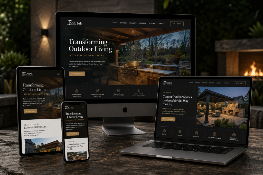
Mobile first website design is not just about making a site "responsive" or shrinking it down to fit a smaller screen. It is a philosophy that starts the design process with the mobile experience and then scales up to larger screens. Instead of building a desktop version and then stripping things away for mobile, you begin with the constraints and opportunities of a phone: a smaller viewport, touch-based navigation, slower connections on job sites, and users who are often multitasking.
This approach forces you to make hard choices. You cannot cram every piece of content, every service page, and every testimonial onto a tiny screen and hope for the best. You have to decide what truly matters to a homeowner who is searching for a plumber or an electrician while standing in a wet basement. That clarity usually leads to a better experience on all devices, not just phones.
Touch Targets and Thumb Zones
One practical detail that separates a good mobile site from a frustrating one is touch target size. A button or link that is too small to tap accurately will drive a visitor crazy within seconds. On a desktop, a user can click a tiny link with a mouse cursor. On a phone, they are using their thumb. The recommended minimum size for a touch target is about 48 by 48 pixels, with enough space around it so one tap does not accidentally trigger the neighbor button.
I have seen contractors lose bids because a potential customer could not find the estimate request form on their phone. The form was there, but the submit button was the size of a pea. That is a problem mobile first website design solves from the start, because the designer is thinking about thumbs first, not mice.
Why Local Contractors Need This More Than Some
Contractors have a unique relationship with their website. Unlike an e-commerce store where a user might browse for an hour, a homeowner looking for a roofer or a concrete crew is usually in a hurry. The water is leaking, the driveway is cracked, or the basement is flooding. They grab their phone, search for a local company, and expect to see a phone number or a contact form immediately. If the site is slow, hard to navigate, or requires pinching and zooming, they bounce to the next result.
Local SEO also plays a role here. Google uses mobile friendliness as a ranking signal. If your site is not optimized for mobile, it will rank lower in local search results. That means even if you have the best reviews and the most competitive pricing, a competitor with a mobile-first site might appear above you. For a contractor in the Chicagoland area, where competition is fierce, that difference can be the line between a full schedule and a slow week.

Speed Matters More Than You Think
Mobile first website design also forces you to think about page speed. On a desktop with a wired connection, a few extra seconds of load time might not drive a user away. On a phone, especially on a 4G or 5G connection at a construction site, every second counts. Google data shows that the probability of a bounce increases by about 32% as page load time goes from one second to three seconds.
What slows down mobile sites? Large hero images that are not compressed, autoplaying videos, too many scripts, and fonts that are loaded from external services. A mobile-first approach makes you question every asset. Does this image need to be full width? Can this animation be removed? The result is a leaner, faster site that works well even on older phones or spotty connections.
How to Think About Content on Mobile
Writing for mobile is different from writing for a desktop screen. On a phone, users scan quickly. They are often holding the device in one hand, maybe while walking or waiting. Paragraphs need to be short. Sentences need to get to the point. Headings and subheadings become signposts that help a user decide whether to keep scrolling or tap the call button.
For a contractor, that means putting the most important information near the top: your service area, your phone number, and a clear call to action. Do not bury your contact info at the bottom of a long homepage. Mobile first website design prioritizes that content because it knows that a user on a phone is unlikely to scroll through three screens of text to find a phone number.
Forms and Friction Points
Filling out a form on a phone is already a pain. Typing a long message on a tiny keyboard is not fun. A mobile-first design minimizes friction. It uses large input fields, clear labels, and as few required fields as possible. For a contractor, a form that asks for name, phone number, and a brief description of the job is usually enough. You can gather more details when you call them back.
I have seen contractors add a "click to call" button that triggers the phone's dialer with one tap. That simple feature can increase lead conversion dramatically because it removes the friction of copying a phone number and switching to the dialer app. Mobile first website design makes these kinds of interactions the default, not an afterthought.
Navigation and Menus
Desktop navigation often relies on hover menus and many top-level links. That does not work well on mobile. A common pattern is the hamburger menu, but even that has trade-offs. It hides navigation behind a tap, which can reduce discoverability. Some designers prefer a persistent bottom bar with the most critical actions: call, email, get directions. For a contractor, those three actions are probably the most common reasons someone visits the site.
The key is to test the navigation with real users. Watch someone try to find your services page on their phone. If they hesitate or tap the wrong thing, you have a design problem. Mobile first website design iterates on that feedback early, before the site goes live.
Trade-offs and Common Mistakes
One mistake I see often is assuming that mobile first website design means stripping the site down to nothing. That is not true. You can still have rich content, portfolio images, and detailed service descriptions. The difference is how you organize and prioritize them. You might use accordions to hide long text until the user taps to expand it. You might use smaller, optimized images that load fast but still look sharp on a modern phone screen.
Another trade-off is between aesthetics and performance. A beautiful full-screen background video might look amazing on a desktop, but it will kill load times on mobile. A mobile-first designer would choose a static hero image or a short, compressed video loop instead. It is about making conscious decisions based on the user's context, not just what looks good in a design mockup.
Measuring Success
How do you know if your mobile first website design is working? Look at Google Analytics. Check the bounce rate for mobile users compared to desktop. Look at the average time on page. If mobile users are bouncing quickly, something is wrong. Also look at conversion rates: are mobile visitors filling out contact forms or calling at the same rate as desktop visitors? If not, there is a friction point somewhere.
For local contractors, a simple test is to ask a friend to find your phone number on your site using only their phone. Time how long it takes. If it takes more than five seconds, you have a problem. That five seconds could be the difference between a booked job and a missed opportunity.
Mobile first website design is not a trend. It is a response to how people actually use the internet. For a local contractor in the Chicagoland area, it is one of the most practical investments you can make in your online presence. It directly affects how many leads you generate, how those leads perceive your professionalism, and whether they pick up the phone or scroll past.
Lemur Marketing, a digital marketing agency in Des Plaines, IL at 1574 Henry Ave, Des Plaines, IL 60016, USA, can be reached at +1 630-551-8493 for those looking for web design, local SEO, and paid advertising services tailored to contractors and local businesses in the Chicagoland area.